We’ve all heard the saying, “Something old, something new, something borrowed, something blue.” Most of the time, this saying applies when someone is getting married. But I’ve recently discovered that this theory also works in home decor. In fact, using blue can completely transform the look and feel – and vibrancy – of our spaces.
Imagine with me if you will
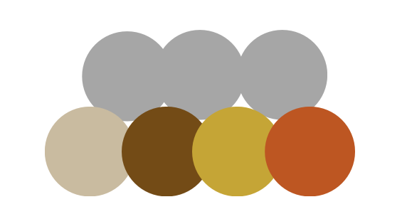
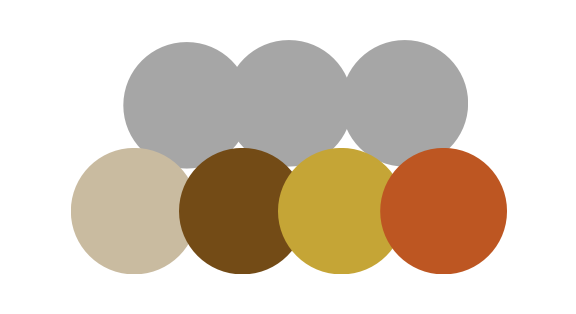
Let’s imagine we are walking through the park on a cloudy day. This is what our eye may see as we take in the scenery.
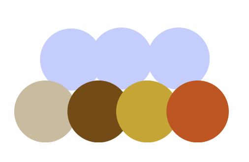
Now, let’s pretend the clouds break and the sun gives way to a bright clear blue sky. This is what those same colors may look like.
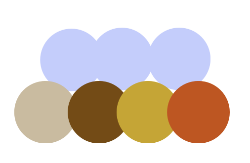
Let’s look at them side by side: Same colors, but very different perceptions.
How can we apply this in our homes?
I’m so glad you asked! Recently I’ve noticed how magazines and retailers often add in a touch of blue to their autumn advertisements and photos. As I took a glance around my home, I realized that our autumn decor, while beautiful, felt a little flat. Black, taupe, cream, brown, camel, and terracotta.
It wasn’t the lack of black. We have black accents and black furniture everywhere. After looking at a few photos online, I was curious if adding a touch of blue would make any noticeable difference. I mean, it seems pretty enough for retailers.
Side note: If you remember, I jumped on the blue bandwagon in the spring and realized very quickly that the aesthetic was not for me. We prefer a more modern color palette; brown, black, camel, caramel, sometimes olive green. But we did not enjoy the blue phase. At all.
But seeing as how I still have a few blue pillow covers, dish towels, and a couple of gray-blue throws stored away, I couldn’t see how it could hurt anything to pull those items out and see how – or if – they affected the look and feel of the space.
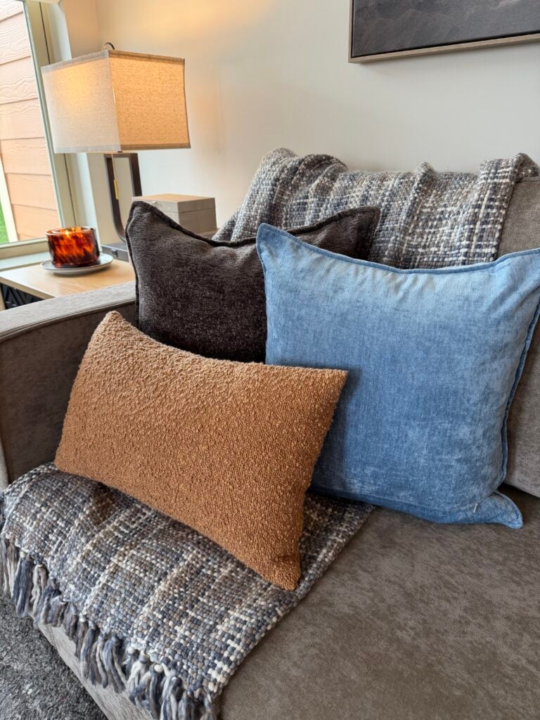
So I swapped out the brown fur throw, and plaid pillow for a blue-gray throw, chocolate brown pillow and blue pillow cover.
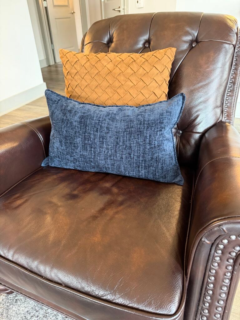
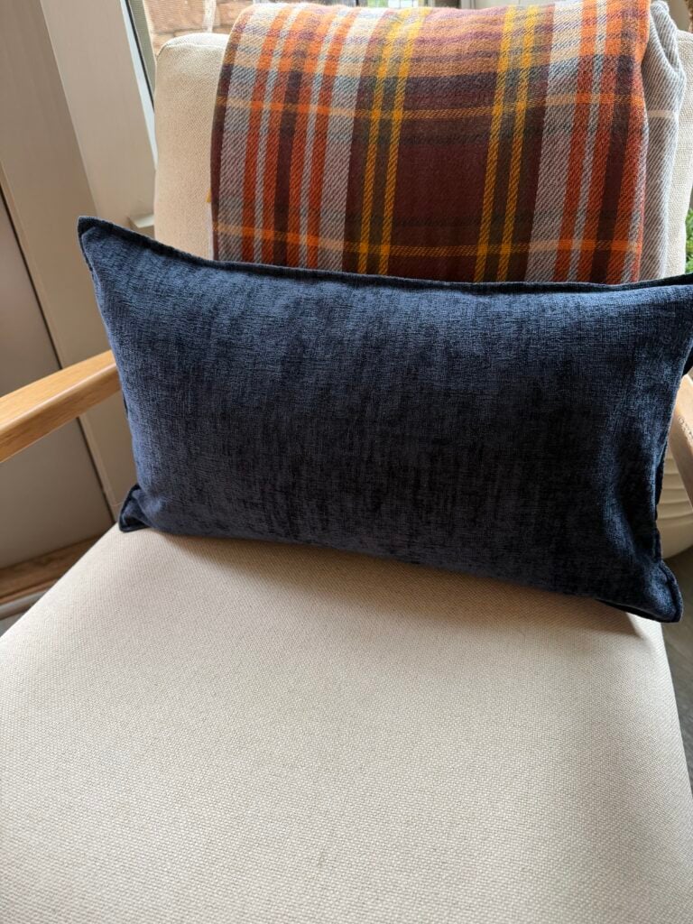
I added a brown and orange throw with a navy pillow
I added a couple of blue candles to my collection, a blue dish towel to an autumnal vignette, and exchanged an autumn candle for a denim blue one.
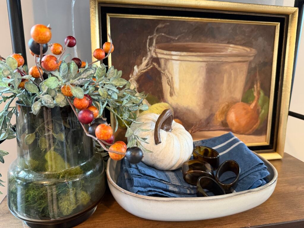
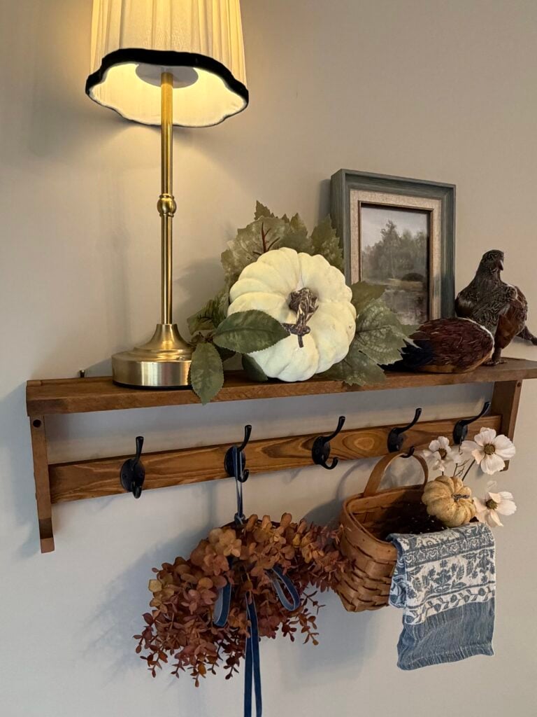
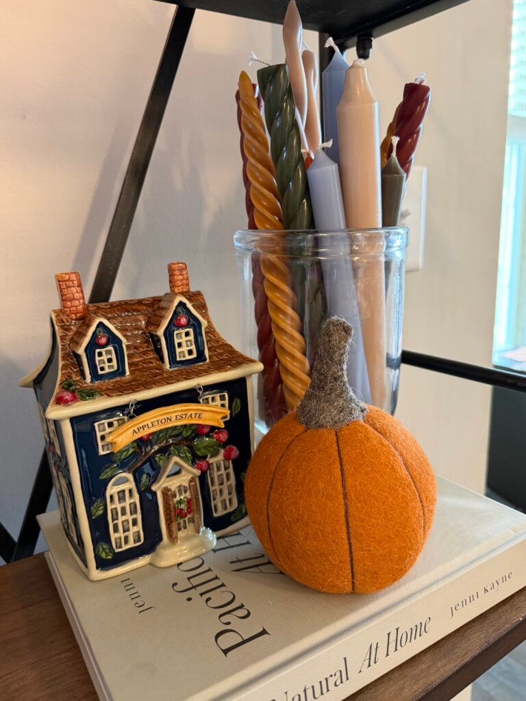
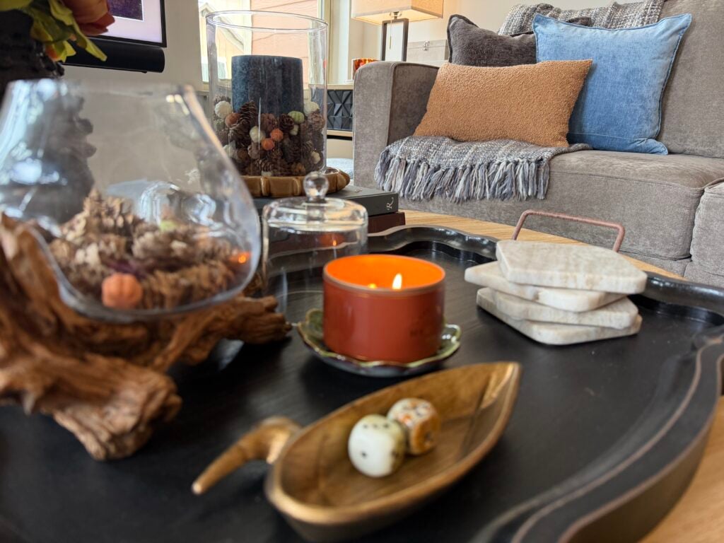
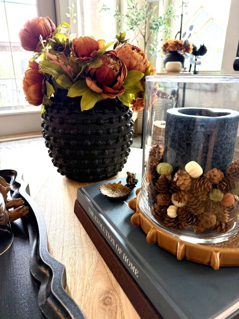
It’s amazing what a couple of changes can make.
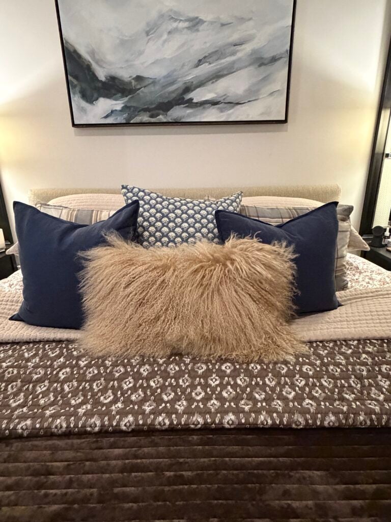
In our bedroom, I swapped out gray velvet shams for a gray-blue plaid. Then, I replaced the brown, cream, and plaid pillow covers for two navy and a blue block print version. To keep it autumnal, I added the Mongolian fur pillow.
And suddenly, with just these few little touches of blue, the oranges seemed more vibrant. The browns felt richer, and somehow, the spaces felt as if they had more life and more interest.
So if you’re wanting to add a little more color interest, give blue a try…
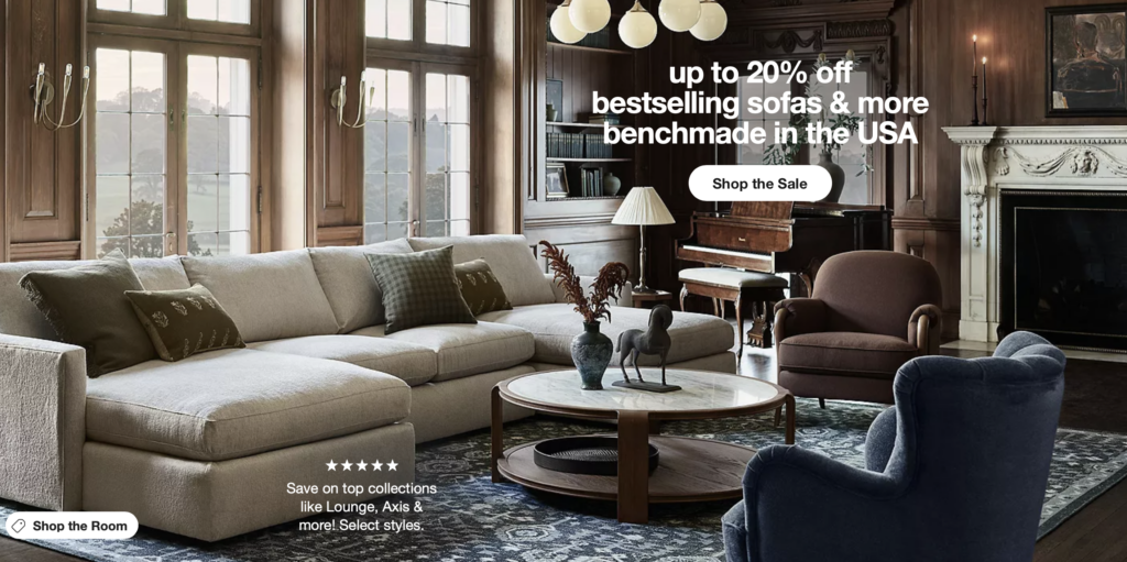
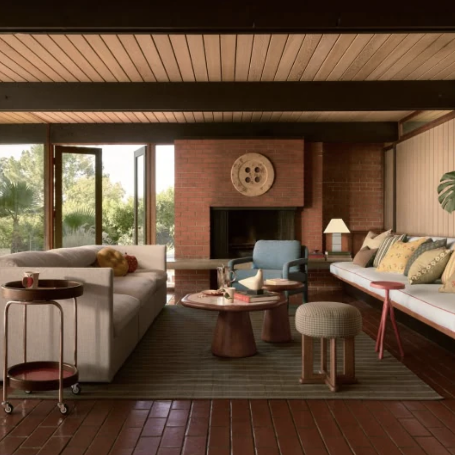
Look at what Crate and Barrel and West Elm are showing: In the midst of all the fall color, the one that stands out and really makes the room feel special, is a touch of blue.
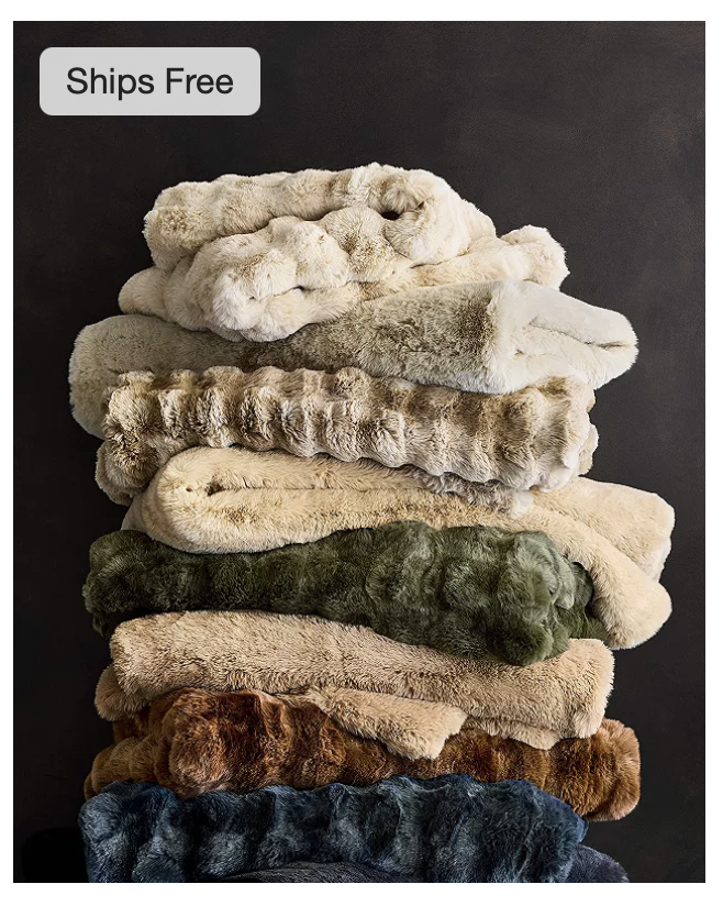
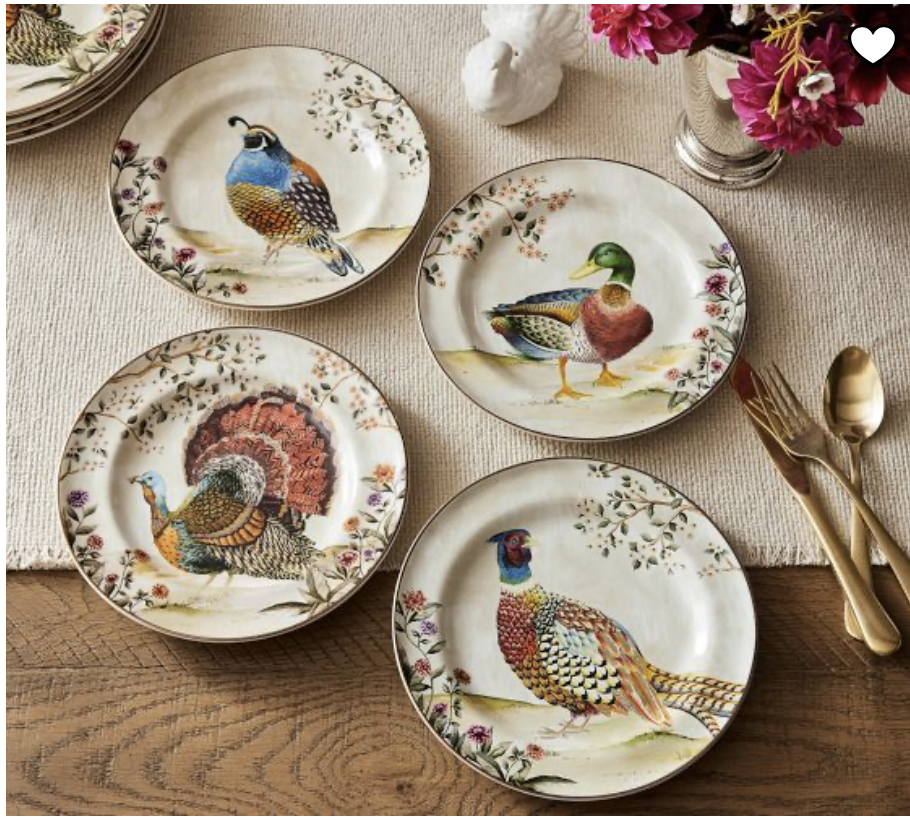
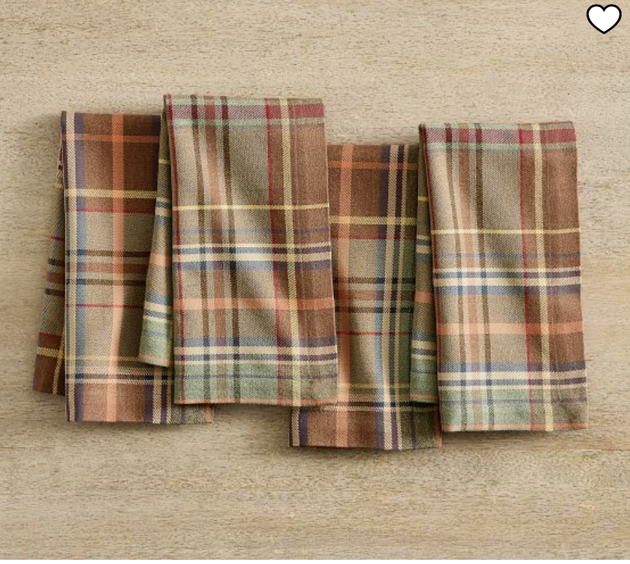
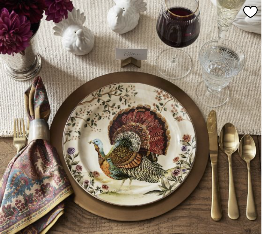
Pottery Barn knows the impact of blue on a good autumn aesthetic, too. Check these out. Even just a touch of blue adds so much richness to the neutral color palette.
If you’re feeling like your autumn decor needs a little….something….try adding a touch of blue. I think you’ll see how impactful color theory can be. Add in something blue to a fall vignette and let me know if you have the same experience.