10 minute read time
Discover home:
Remember when everyone was styling their homes in the Nancy Meyers aesthetic and every store was bringing in the blue and white color palette? Yeah…. I jumped right on top of that band wagon. I must admit, it was refreshing and beautiful and calming and very spring like. But… it just wasn’t me. I fell off that blue and white band wagon about as quickly as I jumped on it.
It was the great Shakespeare who wrote, “To thine own self be true.” While I’m not a fan of that philosophy as a character trait, I am totally on board when it comes to our homes. We inherently know what we like and what we don’t like. It is usually obvious when a style does or does not fit our lifestyle and our personalities. And that is when a great color palette really shines. Let’s look at a real life example.
The core color palette…
For this example I’m going to use the color palette we’ve chosen for our home. Those colors are taupe, chocolate brown, black, gray, and creamy whites. (Let me interject that this is the current color palette. In the fall, I will incorporate more caramels and camel tones.).
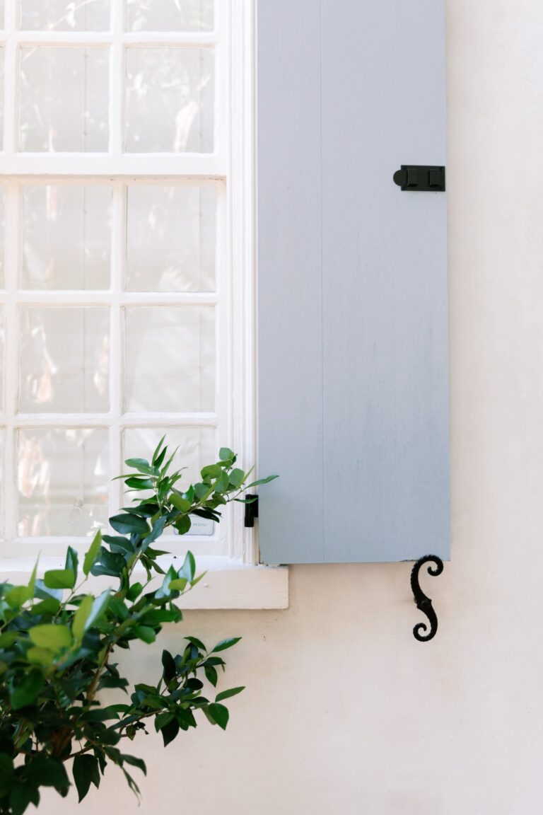
Because we live in a rental property, there are a few things we cannot change. The wall color and trim moldings are gray. The kitchen cabinets are also gray, and the kitchen counters are black and white marble.
We determined that sticking with what we were given was going to be the simplest way to make our living space look as cohesive as possible. So we leaned into the neutrals and began to build our own personal aesthetic. Everything we purchase must somehow fit within this color palette in some way. By doing that, we make sure we have a great core color palette that will fit every room of our space.
Parts of the whole
What a great color palette does for you is gives you a cohesive space, but also works much like a capsule wardrobe. Each item becomes interchangeable between rooms, and gives flexibility when styling and restyling your home.
So let’s look at how to build out a room, given a very neutral color palette. The secret sauce is working with contrasts.
Our sofa is a soft taupe. For this example I’m working with black, taupe, gray, a light camel, wood tones, and browns. There are touches of green also represented in greenery.
Starting with a blank slate is key. For this exercise, I cleared the room of everything I knew I would not want to use. Then, I laid out all of the textiles that I thought I might want to use.
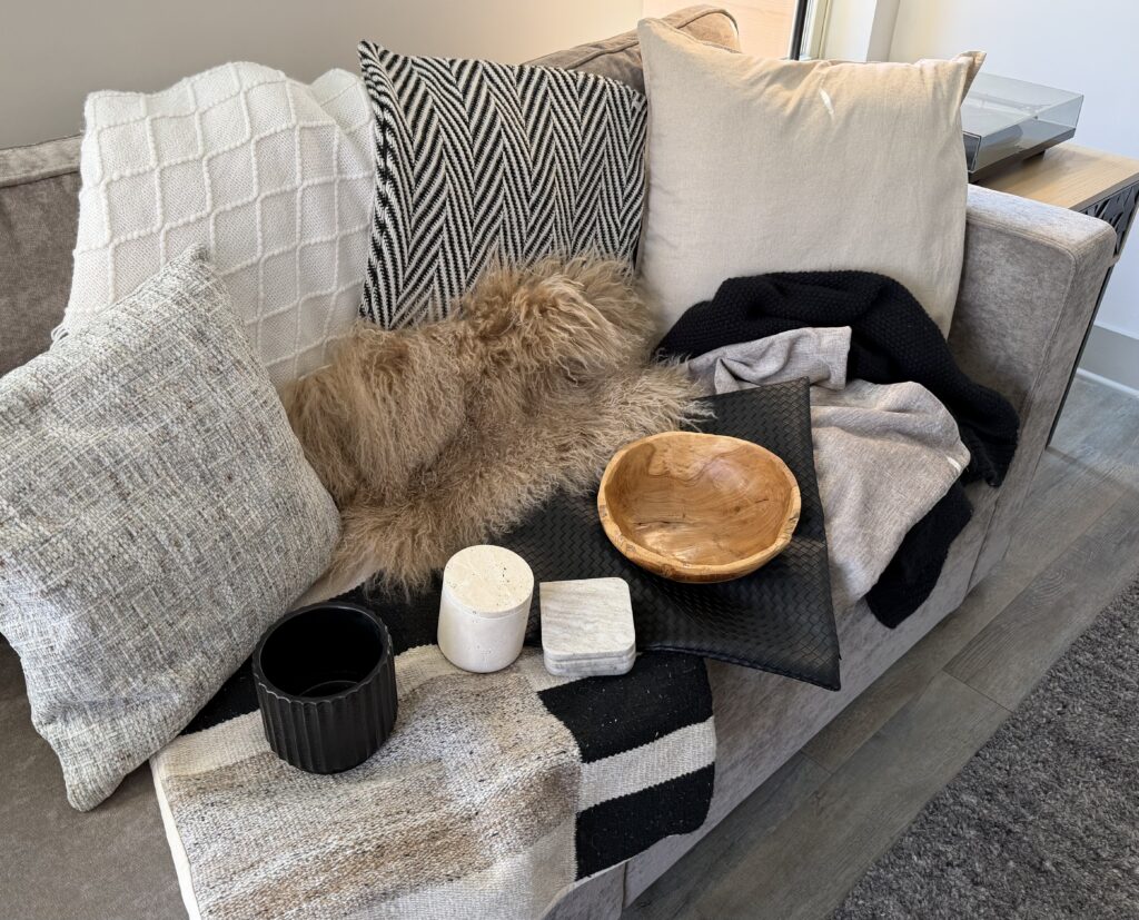
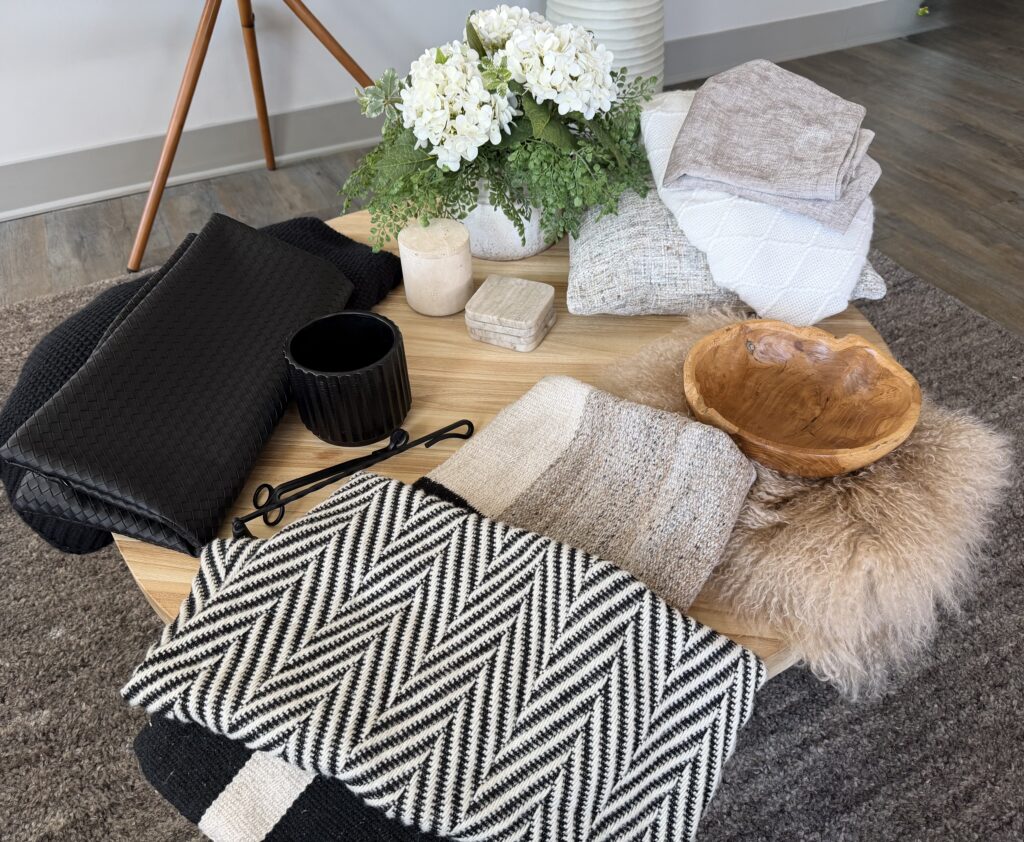
In this case, I chose a black knit throw, a creamy white throw, a black and white graphic pillow, a gray tweed pillow cover, a sheep skin pillow cover, a black woven leather pillow cover, and a large black and taupe graphic pillow cover.
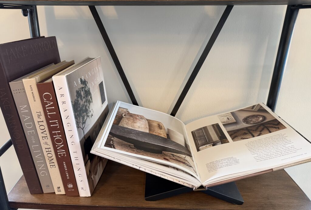
Along with the textiles, I thought I might use some wood tones, a few black pieces, a couple of books, some greenery, and a few marble and travertine pieces. All of these items individually fit into the color palette we’ve chosen. Knowing that each one is part of the whole gives flexibility to create multiple stylings using many of the same items over and over again.
Building on contrast
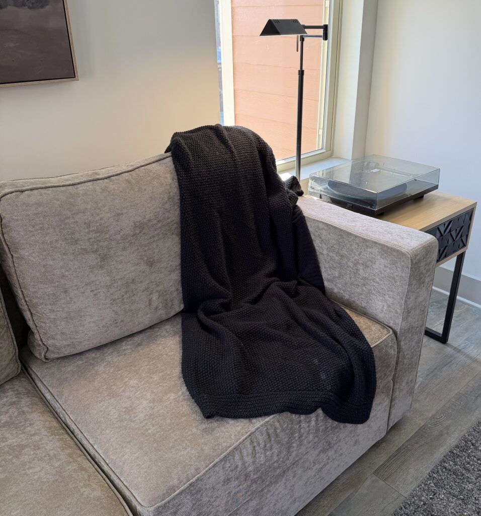
Starting with the taupe sofa, I wanted to build in contrast starting with the black knit throw. The evenings still get a bit chilly here, and having a nice throw to snuggle up with is always a cozy addition.
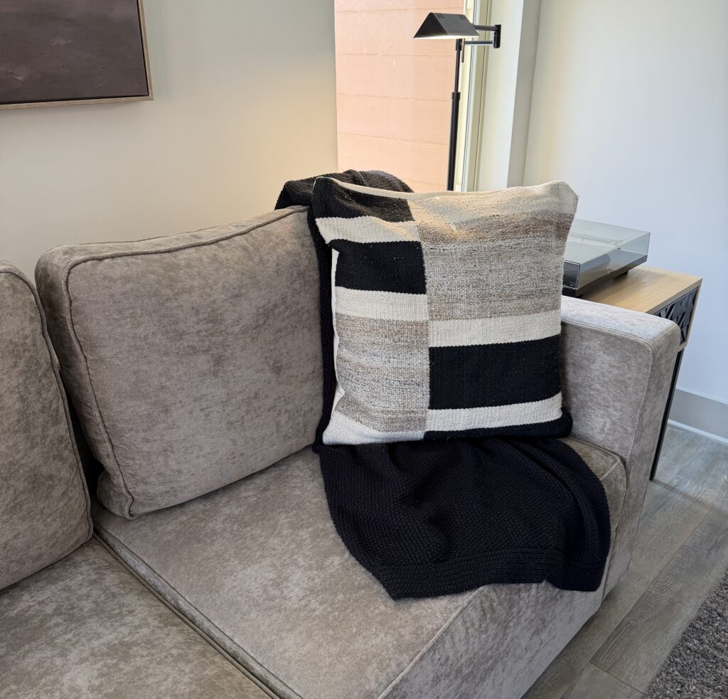
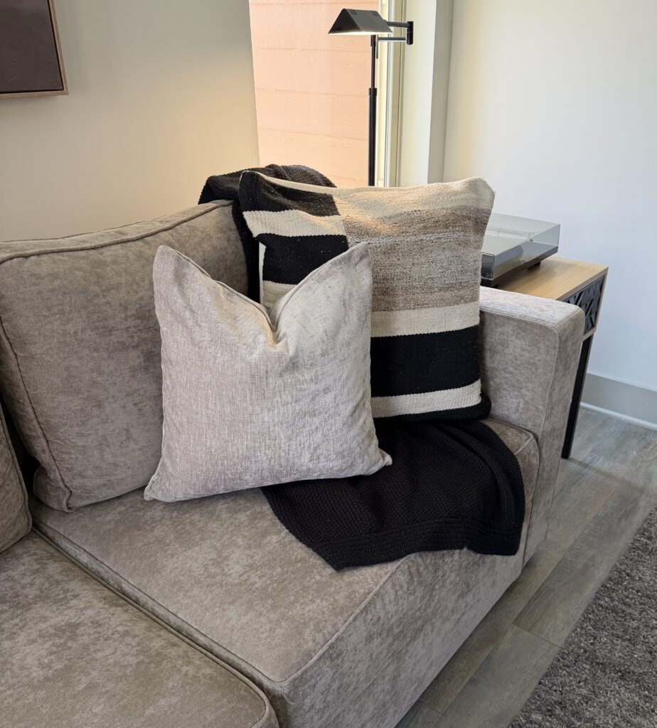
Next, I added in the large graphic pillow. Then, the taupe velvet pillow as contrast to the graphic one. Finally, I added contrast against the taupe velvet with the camel sheepskin pillow cover.
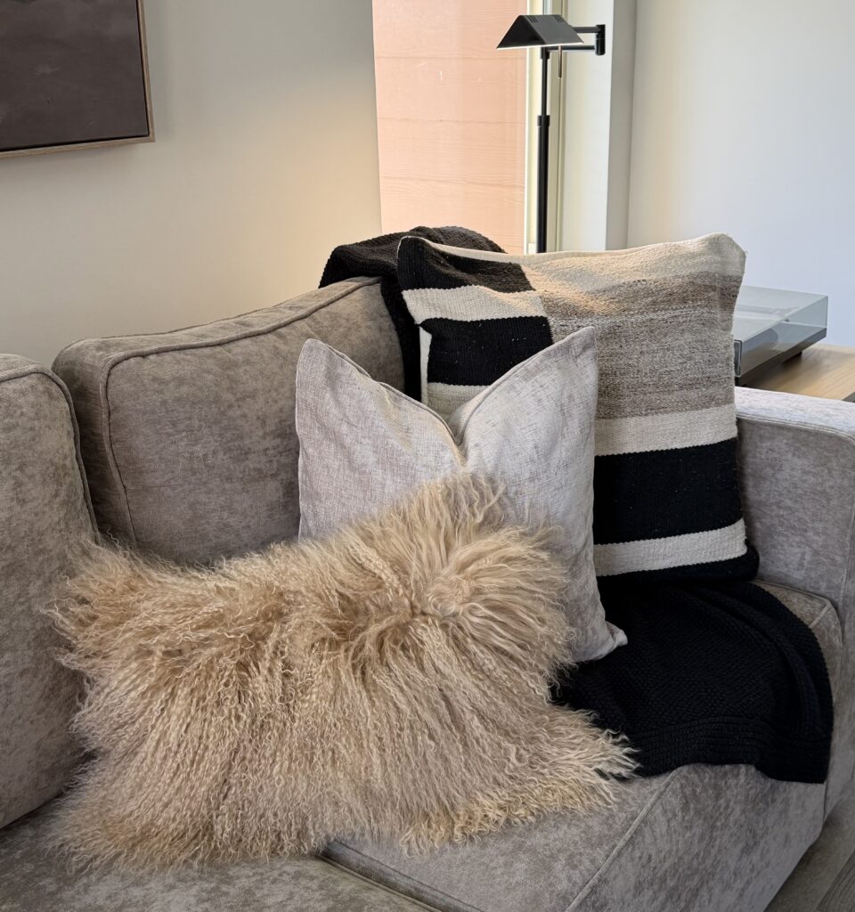
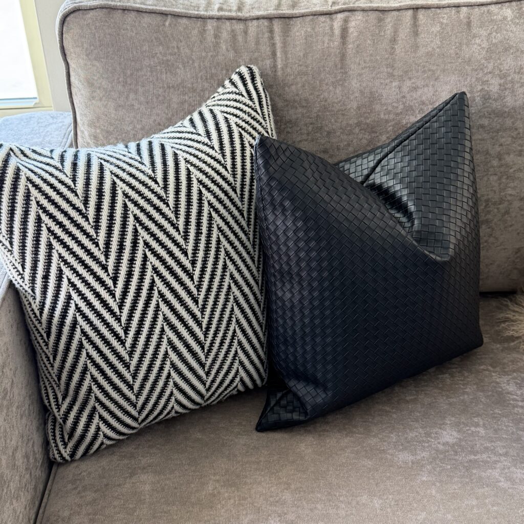
On the opposite side of the sofa, I wanted to balance the graphic with another graphic, choosing a chevron black and white graphic option, along with a black woven leather option.
It’s a balancing act…
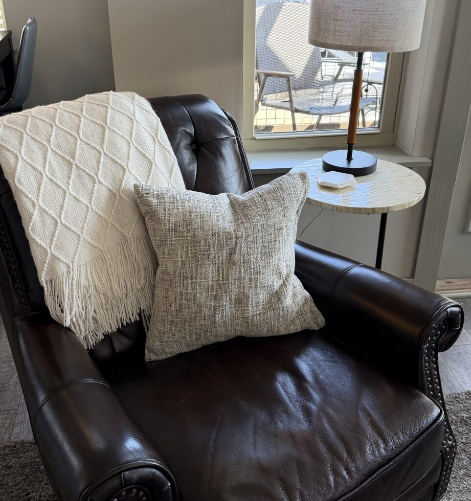
My husband has a chocolate brown leather chair on the opposite side of the room. Again, building with contrast, I chose a creamy white throw along with his favorite gray tweed pillow. Because the cream throw is light against the dark leather, the gray tweed pillow then, contrasts again as a medium tone against the creamy white.
Accessories are the spice of life…
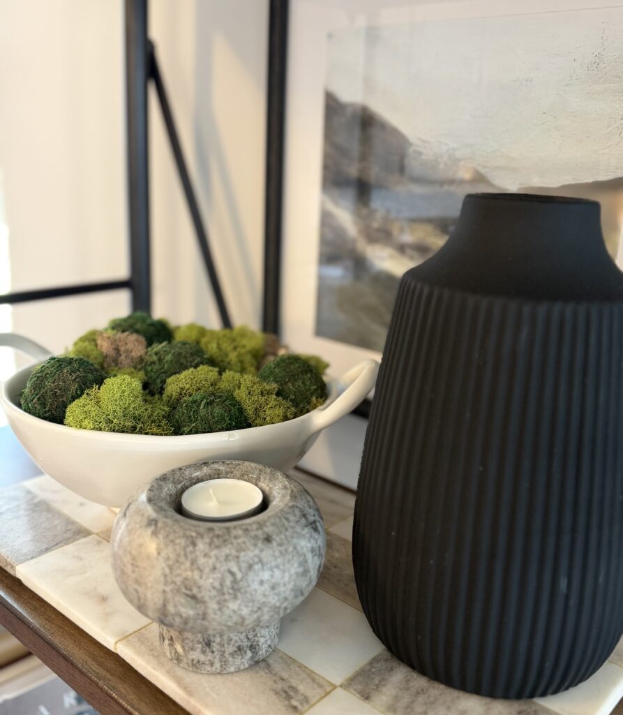
The accessories I chose were a brown leather tray with brass handles, a few marble and travertine pieces, a black wooden moss bowl, a black planter, a few wooden pieces, and a couple of books. Not all items were used, but having a good base to select from gave flexibility and good choice options. Again, remember that accessories should also fit into your color palette.
Build a good strong base:
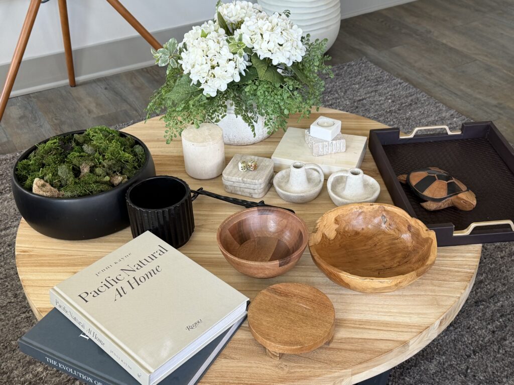
I always start with a blank slate. It’s like beginning a painting with a fresh clean canvas.
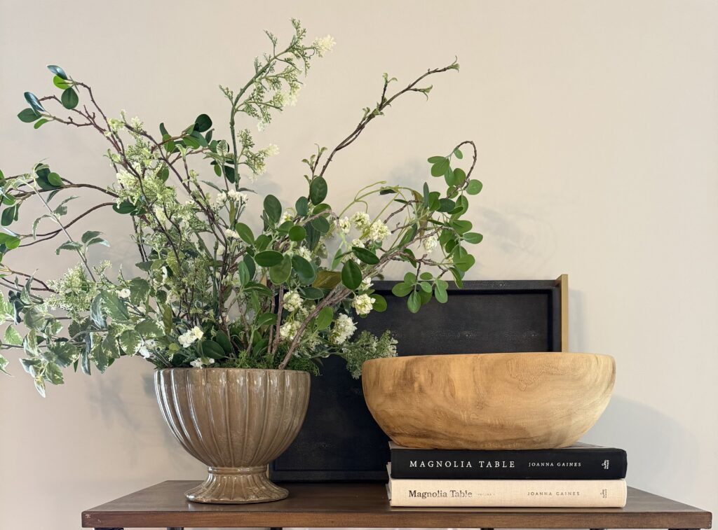
Then, I begin to build in a little structure. For this example, I started by using the brown leather tray and the book stack as risers. The leather tray will be a place to corral smaller items that would otherwise appear as clutter, and the books will provide a foundation for styling pieces such as a vase of greenery and other supporting pieces.
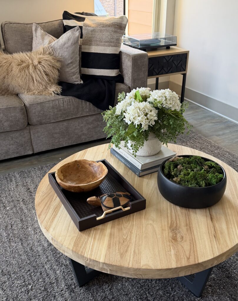
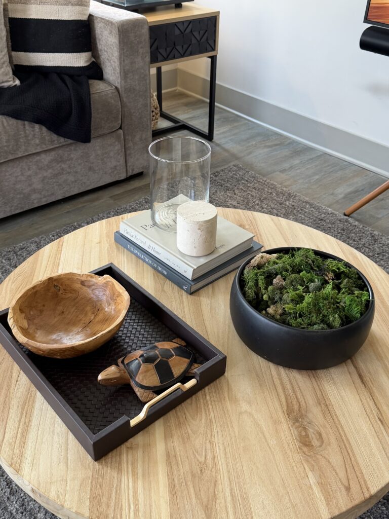
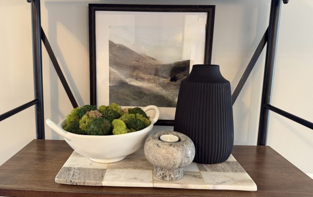
When building in styling pieces, I like to think of how I want the room to feel, not simply how I want it to look. In the versions above, you can see how I played with a wooden bowl, some hydrangeas, and a clear candle hurricane. None of those options felt quite right.
You’ll know when it feels right:
The hydrangeas felt too traditional, the hurricanes felt too visually light. The travertine match holder and the carved wooden turtle (picked up on our travels to St. Lucia) were both going to stay, but would be relocated. The black wooden moss bowl was absolutely a keeper.
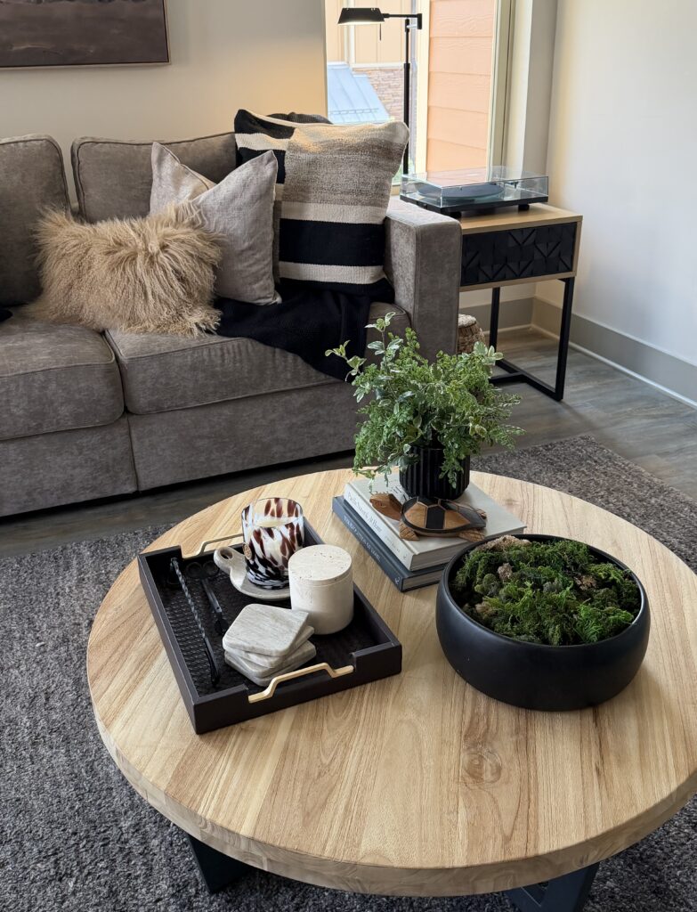
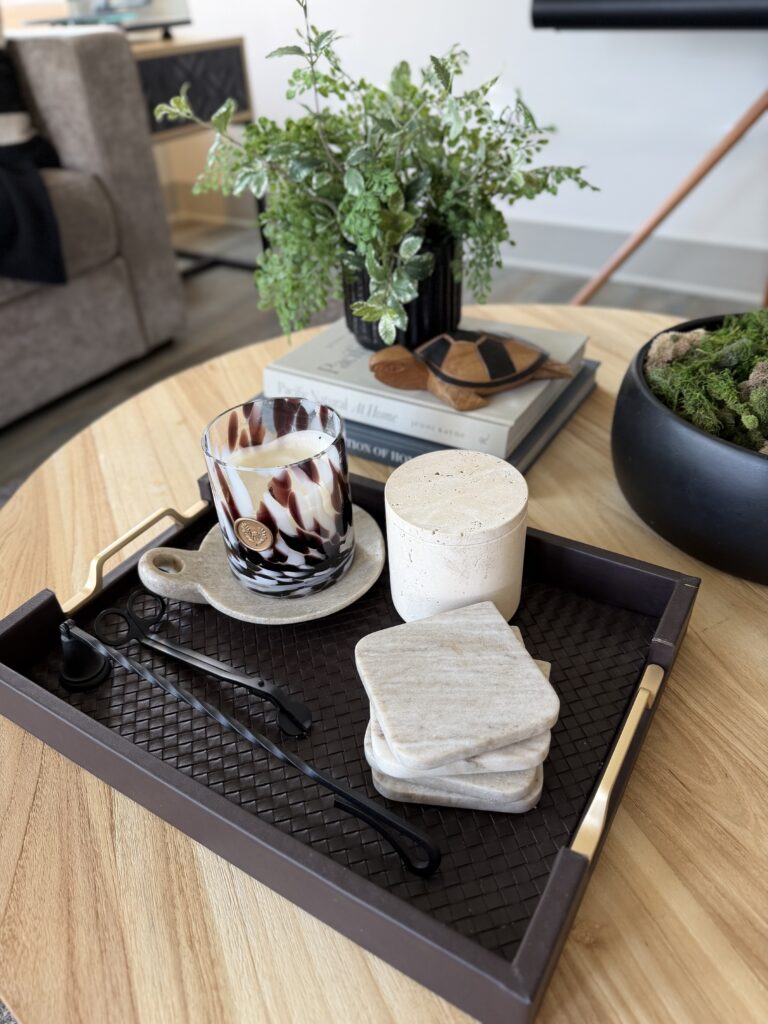
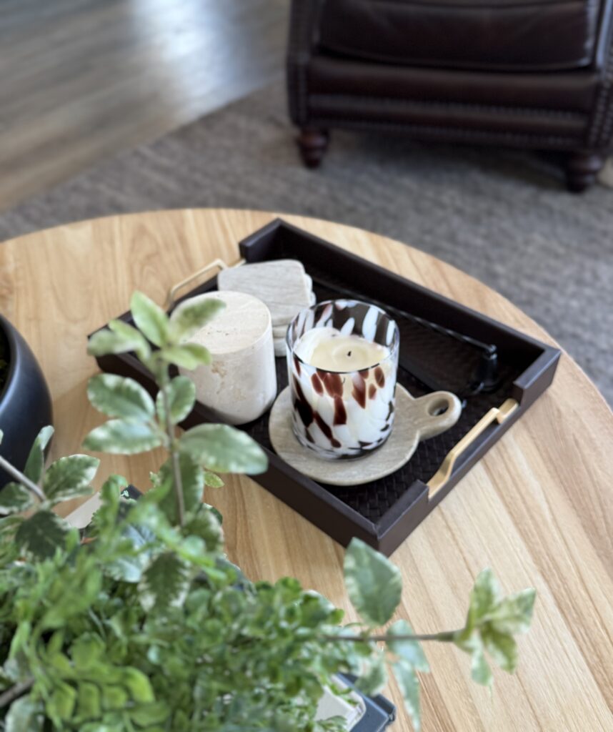
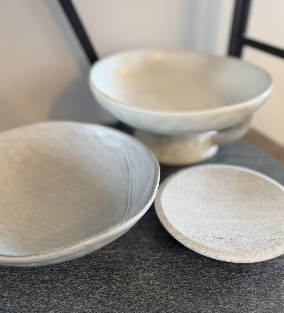
Finally, I ended up with a marble candle dish holding a glass candle, the travertine match holder, marble coasters, and the candle tools placed on the woven leather tray. Most of the items on the tray were light in color, so they contrasted nicely against the dark chocolate brown. The brown was darker in color than the coffee table, so it contrasted nicely there, too. All of the items on the tray and on the table were pulled from the color palette and could have been used anywhere within this room.
Support pieces within the room:
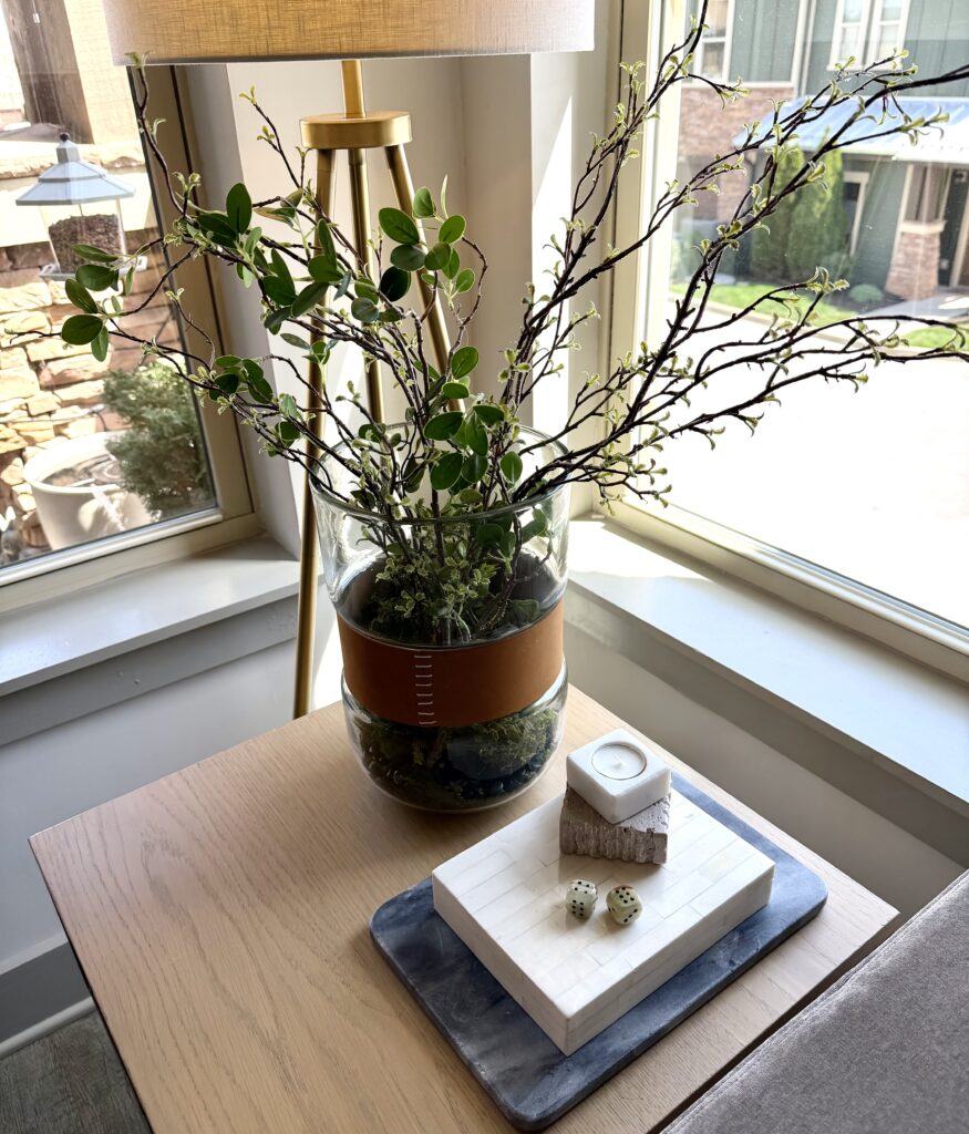
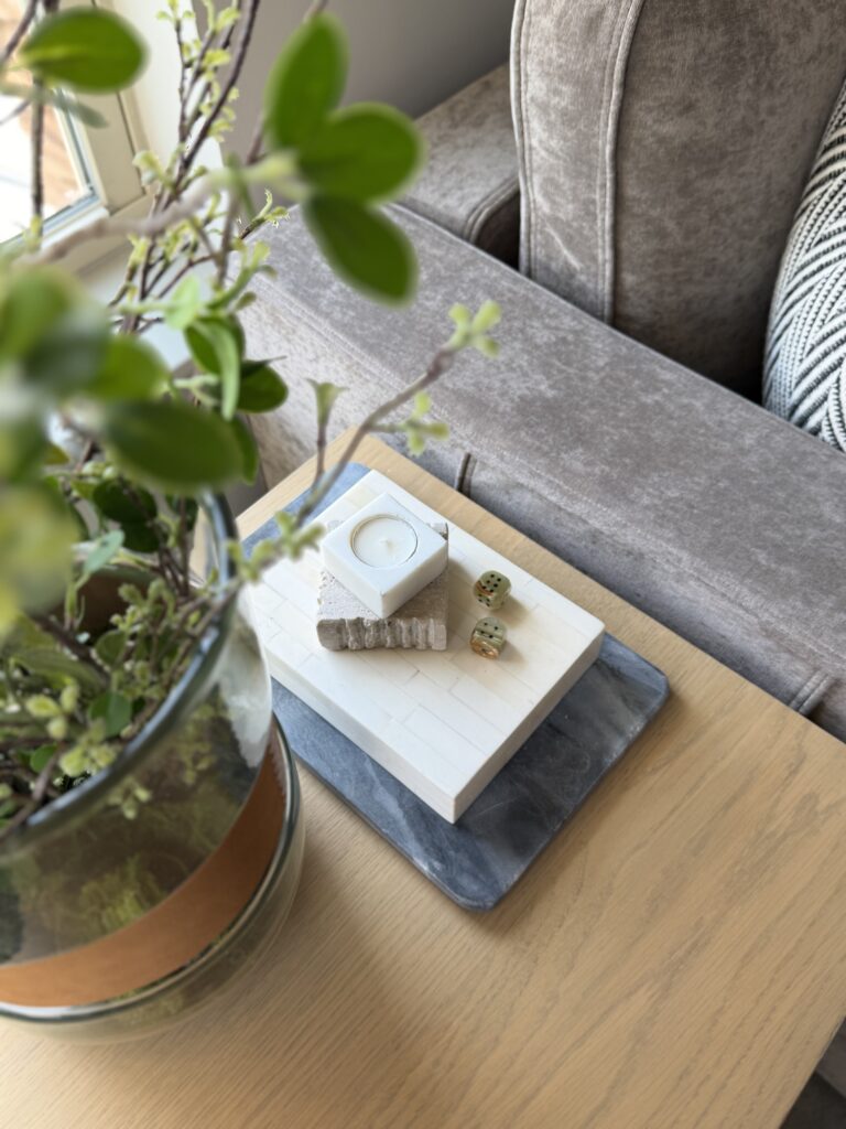
Next it came time to address one of the side tables. (The other holds our turn table). First, I decided on the greenery. I wanted something with presence, but also wanted the greenery to feel airy and light. My pottery barn vessel with leather band was perfect. The glass allows light to flow through from the window, while the leather band coordinated with other items in the room.
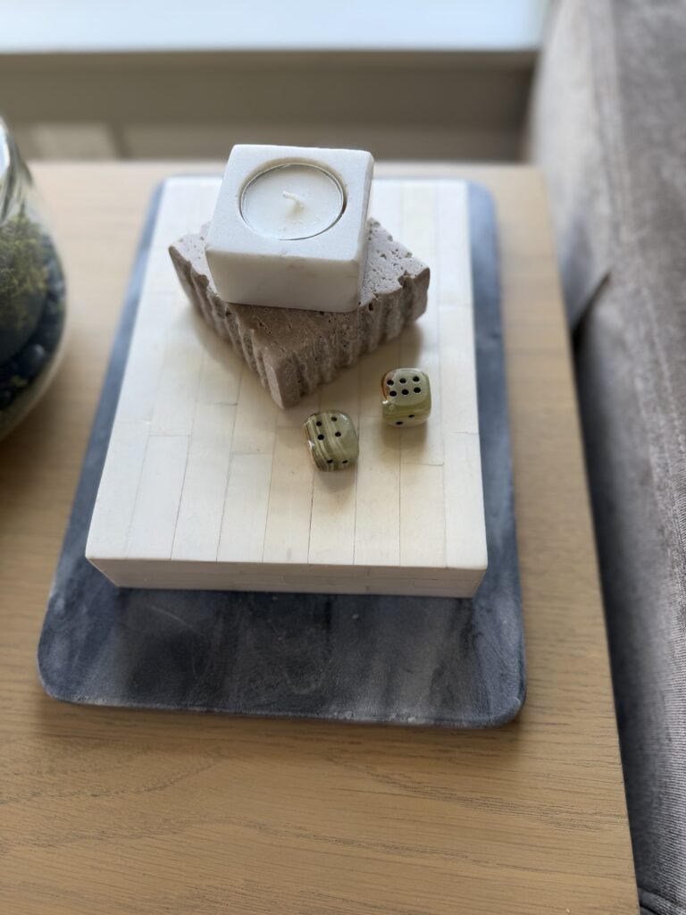
Next to it I placed a gray marble slab, then a creamy stone box. Atop was placed a marble and travertine candle holder and a set of carved marble dice we picked up on our travels.
Remember to use items in your styling that reflect the story you want your home to tell. For us, it’s the adventures we take and places we visit. Within store bought decor pieces we always choose a couple of travel souvenirs to include. They are great conversation pieces, and work well within the color palette.
Every room continues the story…
Our homes tell a story. They tell where we’ve been, how we’ve lived, and what kind of people we are. Our homes disclose if we’re avid readers, love to craft, are fitness buffs, etc.
So each room of our home must continue the story from one space into the next. The color palette is one way to continue the story. Because our living room is open to our kitchen and dining space, the color palette and style needed to reflect one another.
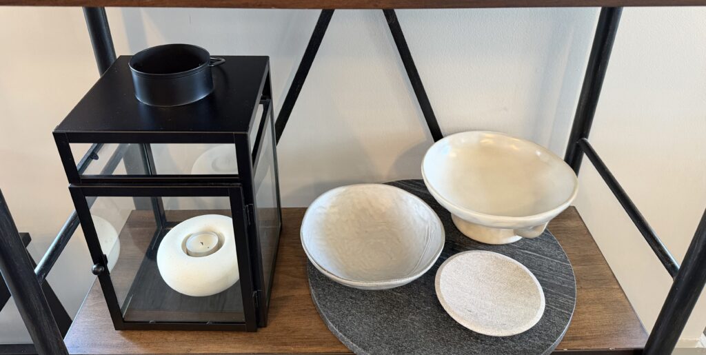
There is one small wall between our kitchen and dining nook. In it I have placed a tall open shelf. It has five styling opportunities.
For this styling area, I chose books, vases, wooden bowls, marble candle holders, candle lanterns, and greenery. All of the items play within the color palette, and give a very familiar feel.
Here is how it looks today. This is one of the most transitional spaces within our home, and we change it up frequently.
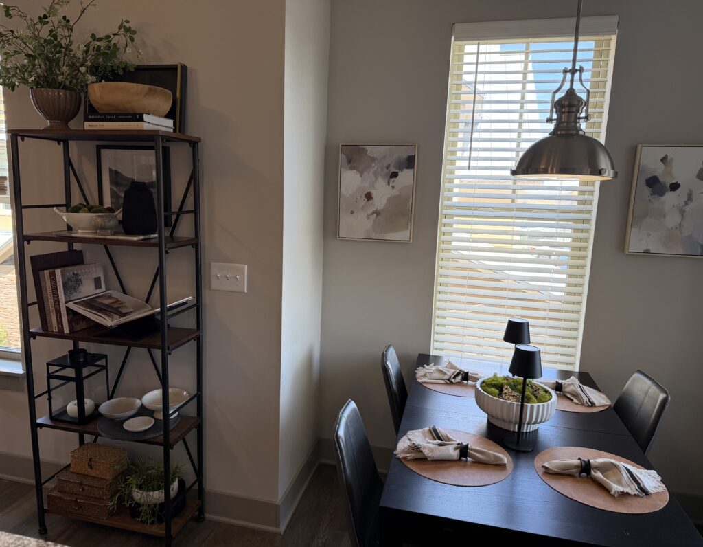
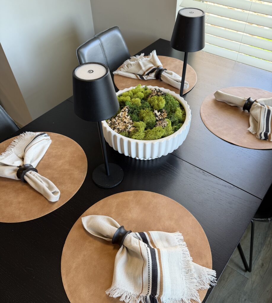
The dining table base is black oak, so placing caramel colored leather placemats reflected the leather wrap on the vase in the living room. The Crate and Barrel napkins reflected all of the colors, and added a touch of softness to the space.
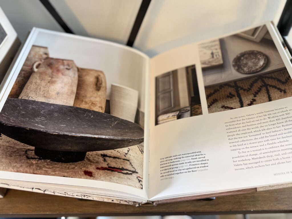
On the shelves, one book lies open to a spread reflecting a black marbled bowl, and several pottery vessels. The color palette in the book’s pages reflect the color palette within the rooms.
Pulling it all together…
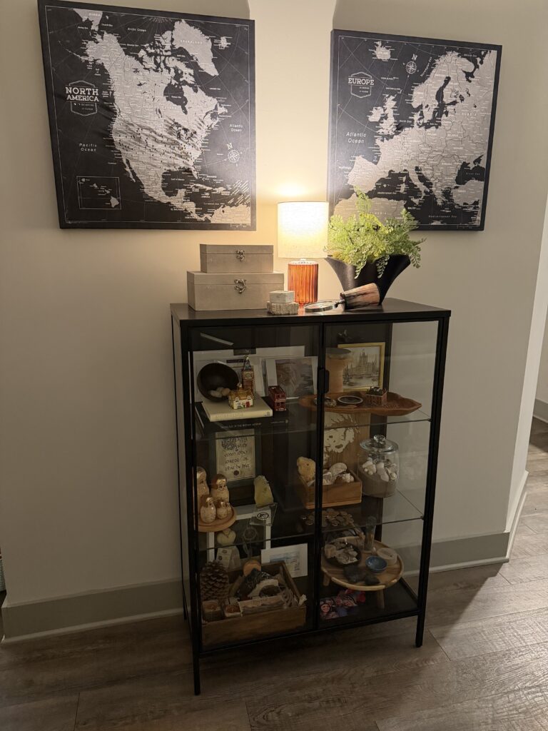
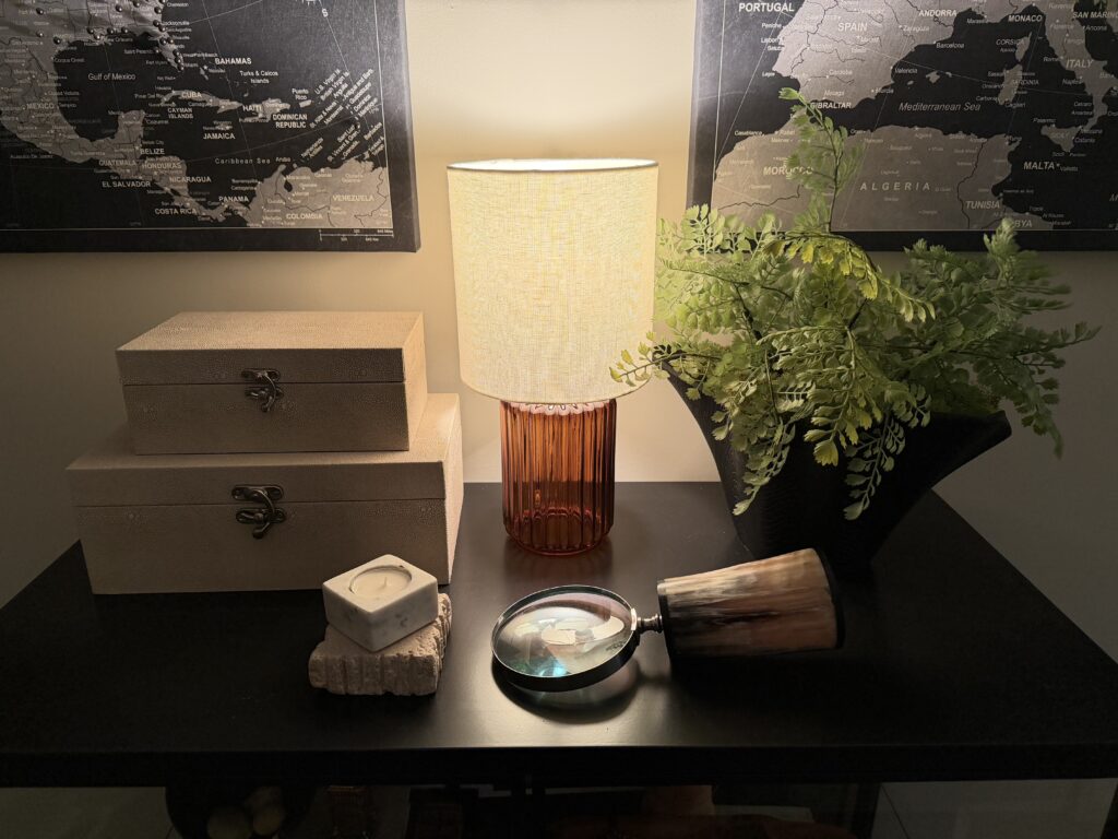
As you enter the apartment you pass through the hallway. Our travel cabinet (cabinet of curiosities) sits there. Two custom canvas maps hang above and each place we’ve visited is marked with a pin. The cabinet itself holds all of our travel treasures. We have been intentional to choose items that work within our color palette. When it comes time to restyle our spaces, we have plenty of meaningful artifacts to pull from.
Atop the cabinet sets a few well-selected pieces. There is an amber glass lamp, a black vessel with greenery, stacking shagreen boxes, a travertine and marble candle holder, and a horn-handle magnifying glass. All within the confines of the color palette.
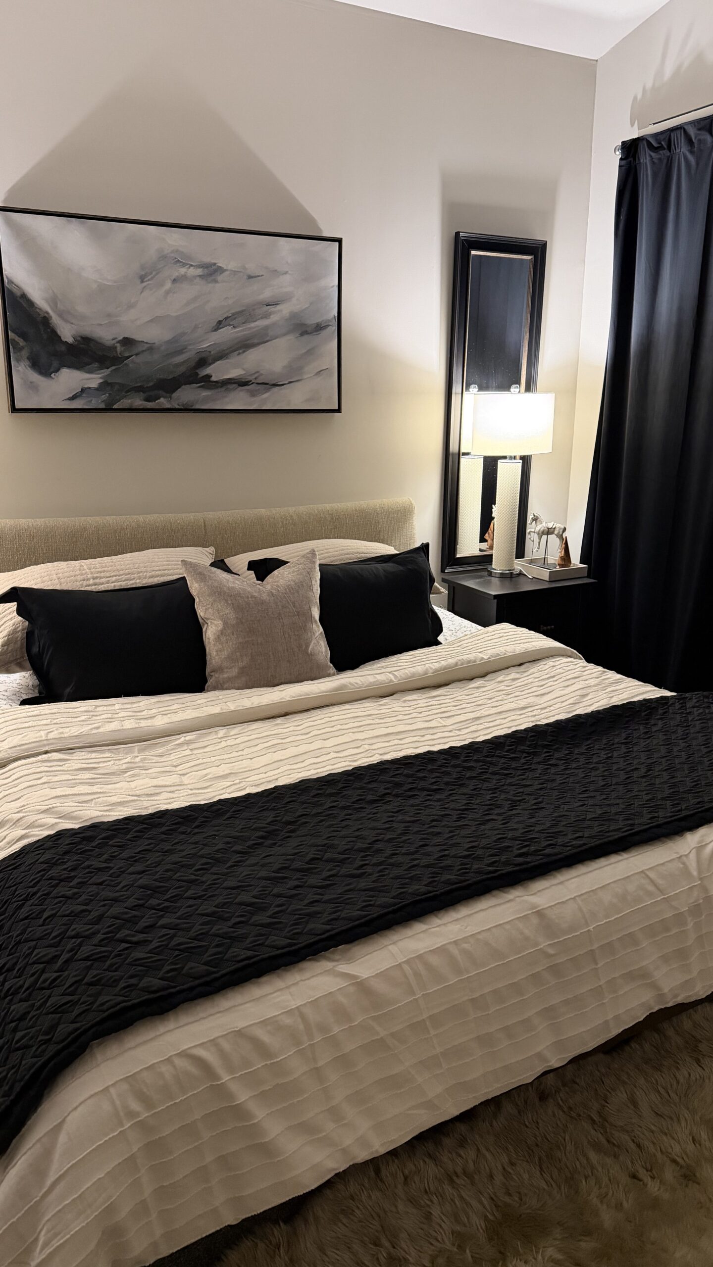
You also walk past our bedroom. I restyled it when I removed the blue and white from the rest of the spaces. Because you walk past this room on the way to the open living spaces, it is important the color palette and color story are reflected here as well.
I kept the silk duvet cover, changed the pillow shams to a taupe quilted version, brought the black shams to the front, and added a taupe velvet throw pillow. The black velvet curtains ground the space and bring a touch of luxury to the space.
The importance of a great color palette
I realize a neutral color palette or apartment living is not everyone’s cup of tea. There is somewhat of an importance to a great color palette. Whether you choose blue and white, neutrals, or reds and browns, be sure the colors of your home tell the same color story if you want it to have continuity and good flow.
The benefit of a great color palette that travels throughout each room of your home is that it will increase the impression of more space. Maybe it’s a calming effect or that each room feels as if it blends seamlessly with the next. Whatever the reason, a great color palette will increase the way you live within your four walls.
Start where you are. Collect your favorite items, begin to build your color palette from them, and then start your own journey to discover a new-found love of your own home!
xo, Billie
resources:
- The Versatility of A Good Color Palette: https://forwardourmail.com/the-versatility-of-a-good-color-palette/
- Creating a Relaxing Atmosphere In Your Home: https://forwardourmail.com/create-an-inviting-and-relaxing-atmosphere-in-your-home/
- Crate and Barrel Organic Napkins: https://www.crateandbarrel.com/craft-black-and-natural-organic-cotton-napkins-set-of-8/s629834
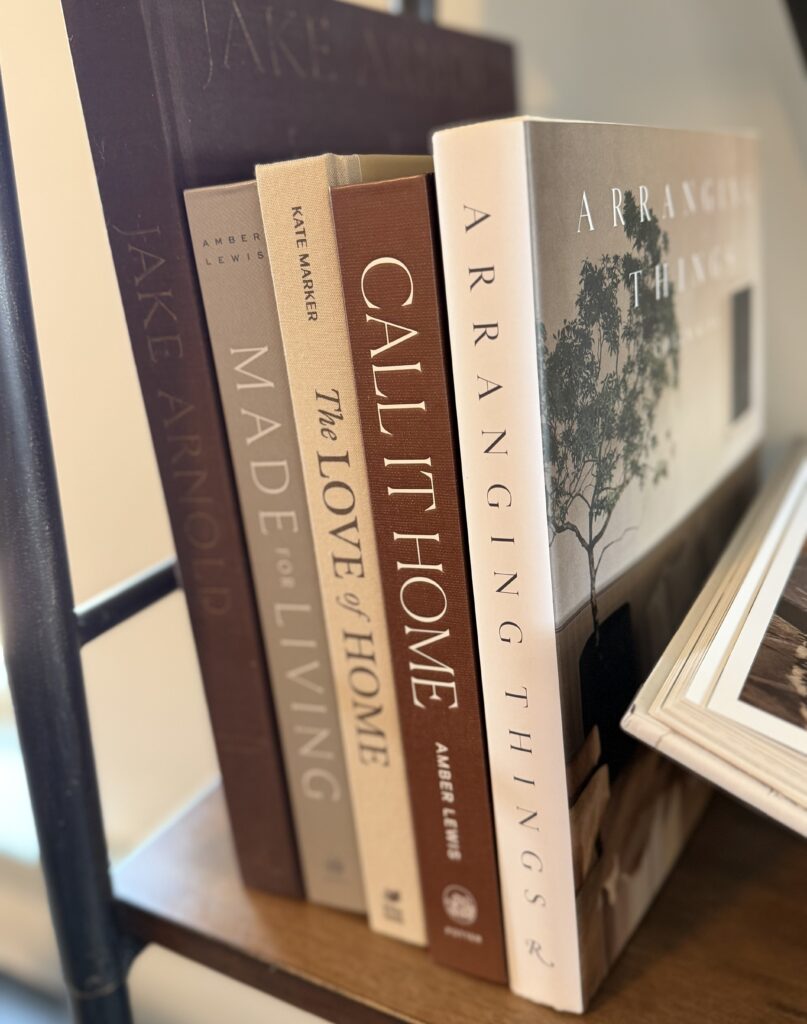
- The Art of Home Book [affiliate link]:https://amzn.to/4uZflDI
- Call it Home Book [affiliate link]: https://amzn.to/4sBqqcp
- Arranging Things Book [affiliate link]: https://amzn.to/4lYntjy
- Made for Living Book [affiliate link]: https://amzn.to/4dQxJIK
- Nomad at Home Book [affiliate link]: https://amzn.to/4ddtaYR
- Pacific Natural at Home Book [affiliate link]; https://amzn.to/4ddtirj
- Redefining Comfort Book [affiliate link]: https://amzn.to/4lYxQUJ
- Textiles for the home in our Amazon Storefront: https://amzn.to/4tP5sr6
- Styling Essentials in our Amazon Storefront: https://amzn.to/4n9rQcm